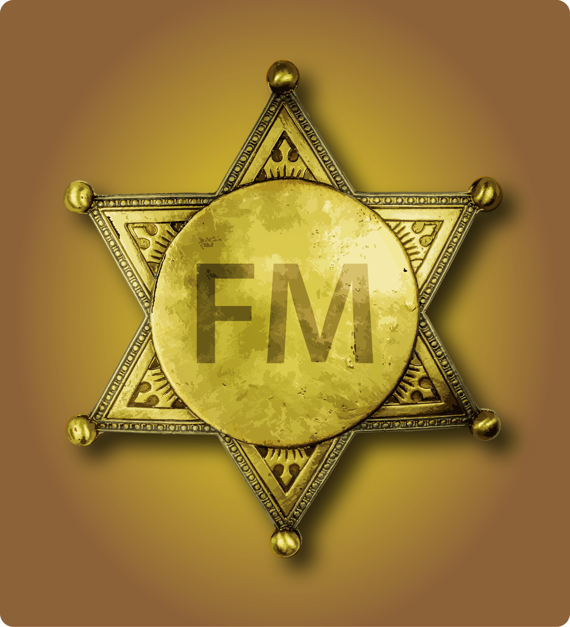
“My name is Marshall, and I want a logo that looks like a Marshall’s badge”. So began this fun logo design project.
I did some research, pulling down reference images to play with, then opened Adobe Illustrator. It’s the go-to software for creating anything that might later be called upon to work at an unknown number of resolutions and sizes and shapes. As I like to say, ‘from business cards to billboards’.
Using a reference image as a template I drew a star and the basic shapes. I added grunge and texture, and all the intricate edge details, then made the metal look worn and scratched to give it an antique metal feel. Finally I added the company brand lettering, ‘FM’.
Putting the logo design onto a gradient background and adding a drop shadow was a finishing touch. This design will look good on pretty much anything. And that is the whole point of vector graphics. They are scalable.
The Benefits Of Vector
From this logo design springboard I have already made business cards, 8″ door hangers, and 18″ x 24″ yard signs. The vector artwork has been handed off to a signage company that will make vehicle decals from it. And maybe, down the line, we might have a billboard. Or brochures. Or banners. Or all of these. All from a single vector file. Try doing that in Photoshop.
I often get brought in to remedy hopeless situations, so trust me when I say this. It is not fun. Vectors are versatile in a way that raster graphics simply can’t match. Many discover this late in the game, judging by the number of phone calls I receive about the subject. I can and do fix the issues brought to me by clients whose logo designer made it in Photoshop and their print provider or signage company can’t work with the low resolution.
Don’t Get Me Wrong
Raster images are amazing. I’m a photographer and a Photoshopper and I love what I can do with raster graphics, but the limitation of raster artwork is that it tends to be made for very specific purposes, for example a movie poster, a print brochure, or a screen presentation. As soon as you try to repurpose it for all three, and throw in a billboard for good measure, you hit a wall.
Rasters can look nasty when scaled up. Ask anyone that has ever been tasked with doing it, whether they are the one that made the logo design or the one needing it. Sure, there are workarounds and ways to resize. I’ve used them myself. But it all adds to turnaround time and the end result is never as crisp and sharp. You always lose some details, don’t believe anyone that tells you otherwise.
Vectors don’t suffer from that. I could design a vehicle wrap in vectors. And have. For a transit bus. This logo would look great on a bus. Or a garage door. On a truck. Again, try doing that in raster graphics. Not fun.
So that just means, use the best tool for the job. For logos, I like to work with vectors. Even if I have it in writing that the client won’t need something else later. Because I know they very probably will. Maybe a month from now. Maybe a year. But they will. And I find it best to start as you may be called upon to finish: Vectors for the win.