Adobe are running a contest right now to celebrate the release of two new fonts derived from the archives of the Bauhaus school of design, a powerhouse of contemporary and modernist styles from its founding in 1919 to an untimely closure in 1933 due to pressure from the growing Nazi regime under then Chancellor Hitler. The story of Bauhaus is one I can recommend taking the time to learn. But it’s not THIS story.
At a loose end yesterday, I decided to throw my own entry into the ring for this contest. The #AdobeHiddenTreasures #contest (yes, I dropped in the required hashtags. Deal.) challenges entrants to use one or both of the new fonts to create a logo. That’s it. Once created, share it on social media with the tags previously mentioned, and sit back. This, I have done.
For those interested in entering, Adobe will choose the winner, who will earn a shiny new 13” Macbook Pro, one year of Adobe Creative Cloud, AND… all the global kudos from their peers that they can eat.
Well, I have a CC subscription and though a Macbook Pro would be nice, I can live without it. The kudos would be cool, though. And though the competition here is intense and the odds very slim, on a practical level just getting an ‘honourable mention’ in a global Adobe contest doesn’t hurt the resume. So…
Let’s throw an hour at this. And begin.
I downloaded the fonts, named Xants and Joschmi, FYI, then created two text blocks in Adobe Illustrator. In each, I placed the entire alphabet, twice. Once in lower case, once in capitals. I set each text box in one of the two new fonts. Then I sat back, and really looked at them. I liked the lines of Xants more than Joschmi, so was drawn to it. I looked at the line weights and ascenders, the x-heights, descenders and stem shapes… OK, I’m boring myself now. What I was looking for was inspiration.
I wanted to see which letters worked well alongside each other, which would offer interesting interaction. Visually, I liked the verticals. I determined that ‘R’ and ‘I’ showed potential. OK, that was my inspiration.
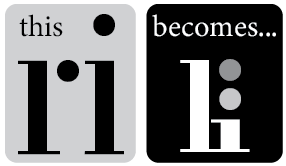
 I chose lower case for their alignment. I wanted the dots on the ‘r’ and the ‘I’ to be aligned vertically, which meant reducing the height of the ‘i’ to allow it to sit below the ‘r’ like a parent with a child. That visual alone sparked all kinds of ideas in my head. I may create other contest entries based just on this… But I wasn’t done with this one yet. I wanted to add more.
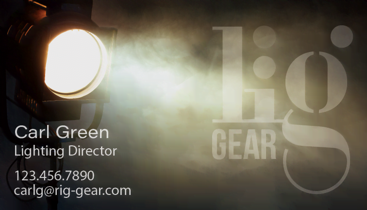
After trying several options for words (rip, grip, trip, ripped) I came up with the letter ‘g’, which gave me the word ‘rig’. I chose ‘g’ as the curves balanced the stark verticals of the other two letters, and by making it larger than the other two letters I created a little tension. Also, the descending loop draws the eye back to the underside of the ‘ri’… at which point I added the word ‘GEAR’ in all caps using the Bebas Neue font for contrast. The descender on the ‘g’ also looks like an electric cable, which ties into the concept I had in my head for a fictitious lighting rig and camera gear rental company. Rig-Gear. Geddit? Cool.
 Finally, I made the dots have different opacities. By doing this, I created subtle vertical and diagonal lines (through the dot on the ‘g’), which again leads the eye to the word ‘GEAR’. Done.
I created a few colour variations as well as the fake business card here. Since this is a fictitious company I made myself the Lighting Director, because, well, why not? I could use a promotion.
Then I shared to social media as the contest requires… and now we wait.
This was a fun exercise. Entering a community contest such as this one really gets the creative juices flowing. Winning is nice, if unlikely. Seeing the work of others is inspiring, and sparks alternate ideas which can be used for future projects. And seeing the amazing work of all the other creatives out there in the world really makes you want to up your own game. There is no down side to this kind of activity.
The resulting logo has, in my mind, sufficient visual appeal to stand alone as an abstract. The company name may (or may not) be immediately obvious, but that’s is actually the kicker here. If you see it, you get it. If you don’t, once it is pointed out the company name becomes unforgettable – which is kind of the point of a logo, right? Check that box. Nike style.
