Some time ago I created a design for a campaign that ran nationally in US print magazines, on assorted web sites, and which was also used in video for trade shows and presentations.
I designed what would affectionately be nicknamed Rubik.
Internally, of course. Copyright and trademarks, disclaimers, etc…
The client company develops EHR (Electronic Health Record systems) that are used across America by addiction and recovery treatment centres, their chosen area of specialty. It handles all aspects of daily administration, including patient histories, treatment plans, and medication management. As you will imagine, it is by design and necessity an extremely complex beast.
That made summing it up in one image quite a challenge. A challenge met, and won.
We sought the CEO’s and money people in the healthcare industry. That’s a hard target to hit.
Several brainstorming marketing sessions identified a shortlist of ‘pain points’, topical buzz words, and features and benefits of this behemoth EHR.
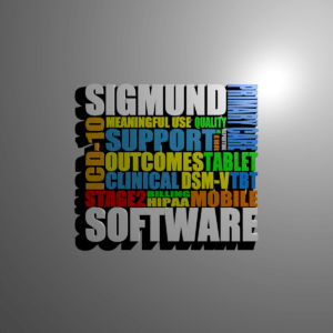
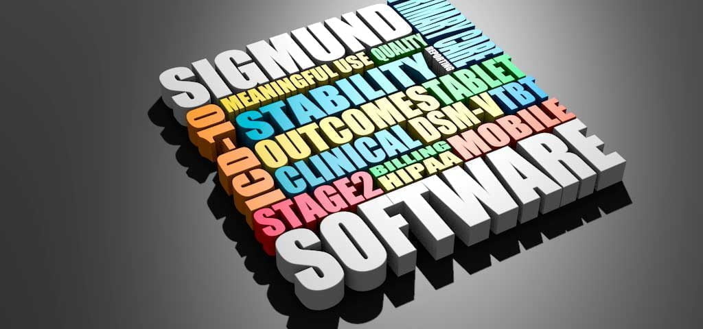
 I crafted those words into a word square, picking each out in different colours. These I extruded to add some depth. Add a plane behind, throw in some mood light… a wall mounted frame. Nice. This was enough for many print articles and layouts. We also used several variations as intros for a series of webinars.
I went further
What if, I thought, I take this square of blocks and use each one as the face of a cube? Enter Rubik.
Being 3D, this can be positioned anywhere. Lit from any angle. Built into any mockup or design.
I could put a camera inside and shine a virtual torch to make it look like a cathedral, or put a bow on it and send a holiday postcard, or turn off the top face and have a jack-in-the-box popping out holding a banner saying “Happy Thanksgiving!”
Yes, we actually did all of these. And much more. For a full year, we had a lot of fun with this campaign.
But these were all flat images. Something was missing. Rubik was 3D. I had used Photoshop, Illustrator, and Blender 3D to develop the design this far. Taking it to another level, I used Adobe After Effects, Cinema4D, and Premiere Pro to spin Rubik in video. That made for some great spot ads and trade show videos.
But what I have never done before, was added Rubik to a web site in this way.
In full interactive 3D glory.
Click and drag to move around. Mouse scroll wheel zooms in or out. Fly across the surface. Spin like a top.
For real fun, zoom in and look around the inside of Rubik. If you are feeling adventurous, go full screen. Just be sure to take your Dramamine first.
I have since worked with this style and refined it further, creating other cubes (and shapes).
The technique has proven highly effective at quickly communicating complex messages, simply, and with great visual impact.
While you are flying around this 3D version of Rubik, just remember that this could be your own message, and that any angle you can see could be a part of a still shot for your own advertising. That degree of flexibility opens whole worlds of opportunity. Your message. Your way. Or rather, mine.
If you need your own Rubik, just get in touch. I’ll make your message fly.
(Additional: This may have display issues on some phones that can't handle this much processing on the fly. If you get load errors, please retry on your desktop. Sorry for the inconvenience.)
