WIP

This discarded concept is an unfinished work-in-progress developed for one of the companies for which I design the advertising art.

Yellow and black are our corporate colours. The concept centres around the recurring phrase “If it was a <this> it would be a <that>, where the thing it would be represents either a feature of the software, or spoke to the quality of the product.

The plan here was to roll out a new concept in this line each week using a new tagline to match the updated art. It was intended to make people to look forward to each new ad, and have them watch keenly for every new distinctive yellow and black advert, keeping their interest and building product awareness.

This type of campaign is a good concept, one that I have used to great success on other campaigns. This one, however, didn’t see the light of day. I may go back to it someday to put the finishing touches to it but right now it’s just gathering electronic dust in the WIP folder of my collateral library. Came across it today again while doing my month end backups and reorganizing.

Rather than just keep it sitting on my hard drive I thought I would share it here and let it see daylight. Fire up the engine and take it out for a spin, so to speak. Hope you like!
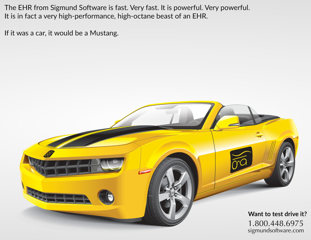
If Sigmund Software was a car, it would be a Mustang
Click to view larger image

Before and After

Many people will see a photographers’ work and say “Wow! You must have a great camera!”

That’s like telling a world class chef that he must have a nice oven.

Waving the camera around is the comparatively easy bit. When you get the photos into the computer, that’s when the magic begins.

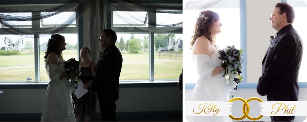
Take this photo. Very difficult lighting, the sun through the windows was silhouetting the happy couple. Without blasting the flash and ruining the ceremony, you have to adjust your strategy. I exposed for the outside light knowing that when I adjusted in post the windows would be blown out to white, giving me a beautiful soft glow, correctly exposed faces, and no distracting greenery.

I didn’t stop there. The minister standing between the bride and groom was also far too distracting. Her smiling face was the natural focus of the photo, but I wanted to show the love in the eyes of these two as they gazed at each other. They were the only people in the world at this moment. The minister, a wonderful woman, had to go.

Phil and Kelly - before and after
Click for larger image.

This is where Photoshop skills come in. Removing the minister using a combination of masking and the healing brush, I then clone stamped the window frame and wall in place and adjusted the shading to match the scene. I tweaked the colouring, adjusted the RGB curves, and used some adjustment layers to add warmth. After adding the ribbon and linked rings, I used my favourite script font to add their names in gold, and finished the whole thing with some final tweaks in Perfect Effects. After applying some noise reduction and sharpening, it was done. An hour well spent, and on to the next photo. You cannot do all that with just a camera. Even a great one.

The high resolution version of this ‘after’ photo became the cover for the wedding album.

It is something the happy couple will be able to look back on at their 50th anniversary, and smile.  It is their perfect memory. That was the plan. That is always the plan.

A Toast to the Newlyweds

Last Saturday, May 30 2015, I was asked to be the wedding photographer for two friends. As anyone that has been in this position knows, this rarely ends well. All kinds of things can go wrong, and long-term friendships can turn into long-term bitterness. Fortunately, that is not going to happen here.

Kelly and Phil have been together for some time. They finally decided to tie the knot at the Bethel Community Centre in a low-key event attended by a select group of friends and family. No releasing of doves. No ticker-tape cannons. Just a minister and the people they loved. And it went well. Very well. Continue reading A Toast to the Newlyweds

Time, gentlemen, please!

When I was a boy I spent a lot of time in bars. Specifically, one bar, the Malt Shovel. As a latch key kid I would swing by to meet mom as her shift as a barmaid finished. I would help clear tables, collect ash trays and, occasionally, bat my cow eyes at the stragglers and ask them to bugger off home so I could get out of there.

It is not legal here in Ontario for bars to sell alcohol for take out. In England, back when I was a boy, it was common. Many bars had a separate entrance or window where you could pick up beer without having to actually go in the bar.  It was called ‘out sales’, as in, you take it out.

This was also great for the more enthusiastic drinkers who, having reached the point of being cut off by the bar staff,  would accept banishment gracefully and just take a couple bottles for the walk home, to keep out the cold, doncha know. Very civilized.

Compare that with today. I wonder if that old fashioned style was not a better way. Drunks don’t walk home these days, they drive. That’s not good. Worse, because they can’t get a drink to take out, they stay longer and have those extra drinks at the bar instead. That’s also not good.

So here is my question: Does it make more sense to have out sales, or not? To me, it certainly does. It allows bar staff to move drinkers out without arguments. It makes the roads safer and keeps the patrons happier, since they don’t have to put up with the offensive drunk that just left.

Anyway.  I’m just reminiscing about those long distant days when I stood knee high to a grasshopper and learned far more than I should have from the regulars at the bar. I won’t call them happy days, but do you know what? They were not at all bad.