We Bought A Tree

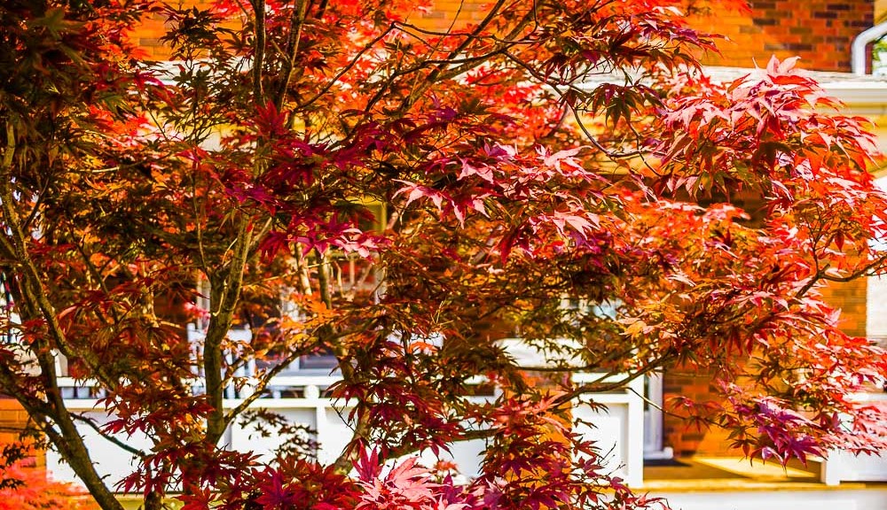
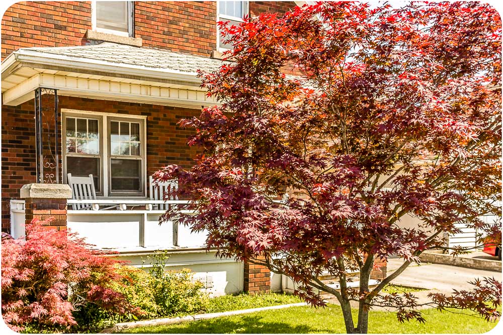
Dear diary, today the edible Nikki and I bought a ten year old Japanese Red Maple. For my UK peeps, that’s a tree. This fine specimen of Mapledom reaches for the sky in every shade of flaming fire red the mind can imagine and outshines even the blazing noon sun of a Canadian Summer. The leaves glow with rebirth, new life, and the promise of summers yet to be, and it is very beautiful.

We paid a good price for our tree. Some may think we paid more than we should.  But that’s not fair. They don’t realize that this tree came as part of a package. To buy this particular tree, we had to suck it up and agree to buy the four bedroom house that came with it.

So we did.

Our House (cue Madness riff, long live Suggs) is on a 40′ by 165′ lot that we have big plans for over the next however many years, starting with a raised rear BBQ deck and a vegetable garden. One day, maybe even a pool. There is a full basement, and my first planned purchase is a beer fridge, and that beer fridge will sit right beside the spot on the wall where I will lovingly mount the dartboard I have kept in storage for many years, waiting for just this very day. Nikki wants a push mower. I love her very, very much.

The front of the house has a veranda which looks across the front yard to our Japanese Red Maple. We plan to spend many years sitting on that porch in rockers, watching our tree grow and waving at the ships passing through the Welland Canal at the end of our street, as they ply their way to the four corners of the earth.

104 Bell Street-8

It took many years and a lot of blood sweat and tears to get here. We earned this. This has been a long time coming. This is us, hitting the slopes of Mount Retirement. As we slide down that slope we aim to add wheels, to make the slide even more uncontrollably fun.

Once we have a garage (second major purchase), I want a ride on lawn mower (because that’s a big-ass yard!), then a snowmobile, a boat, a Seadoo, a motorbike or two and, if I survive long enough to make it happen, a Batmobile. ‘cos why the hell not?  Think big.

Well, that’s the next twenty years planned for. Now we just have to figure out how to make it happen. And that, my dear readers, is all going to be part of the fun. Yay. Retirement, here we come.

Run Me Over. I Double Dare You.

A good advert can stop traffic. A really good advert can make traffic too scared to pass. This, I say, is a really good advert.

Designed for my own company, GYST Services, it gets the message across in a highly visual and effective way. It says that small can be powerful, and versatile, and aggressive. It says we got game. And it says we can hold our own against the big boys, and win. Just like GYST, in fact.

Here, it’s Muscle Car vs Cube. Cube wins. Cube always wins.

And it speaks the truth: Never underestimate the stopping power of a well-placed advertisement. Want one? 🙂

dared

Something Old, Something New. Something Vintage

I don’t get as much time as I would like to work on personal projects. Well, strictly speaking I do, it’s just that I have to be in the right frame of mind, and that can be elusive after a solid day in front of the camera / computer doing the commercial work that pays the bills.

I composited this image from several source images, not all of them ideal, but I made it work. The shot of Whitby harbour was taken the last time I was there, from the famous Abbey walls, home of the Dracula legend. The view from here really is quite breathtaking and I recommend it to anyone visiting the area.

While in Whitby you should check out the Magpie restaurant. Famous nationwide for the best Fish and Chips, and most of the TV crews that film around the area eat here, so you may bump into someone famous. You can see the Magpie in this image if you look closely. I can. Follow my eyes. I’m looking right at it!

Little Whitby
Click to see this image in its full glory

When the composite was finished I tried to come up with a colour tone that set it off to best effect. I maxed saturation, tried photo filters, HDR and high contrast, low and high key variations. All the usual variations. None of them worked for me, and since this is my project I wanted it to look my way, so I kept going until I came up with this retro look. I like.

Intended to look aged, as though clipped from an old newspaper and stored in an attic for almost a hundred years. For some reason, that resonated with me and seemed the best look for this image. I guess that’s the frame of mind I’m in today. All good. Enjoy.

WIP v 2.0

My last post showcased a work-in-progress (WIP) for one of the many companies I work with. For each company I routinely have many folders full of collateral to call upon, and for each I always have at least one WIP. Here’s why.

Any creative brief leaves much room for interpretation.  It’s my role to interpret what is asked for, choose a path to that ultimate goal, and then create something wonderful. It’s on me to make the client go “Wow!” And that brings with it both a challenge and an opportunity. This is all part of the joy of design.

The challenge is to visualize exactly what the client means when they say something like “I want something dynamic!”. That broad concept and what it means to me, may not be what it means to the person speaking. Dynamic can mean interactive, or giving the impression of motion. I have, in fact, seen this very sentence yelled out lout, accompanied by a palm slamming onto a table. I even once watched as a CEO did a little Superman impression complete with accompanying “Whoosh!” flying sound. I kid you not.

Those are the clients that don’t really know what they want, and do you know what? They don’t need to know. They just want me to pull something amazing out of my hat. And that’s where the opportunity comes in.

In the absence of specific guidelines, you need to come up with your own starting point. Make your own design decisions. Choose the direction and the meaning of what you create. Many of my clients want me to come up with all the ideas. That’s fine. I actually prefer it.

I usually begin by asking for two colours. Then I ask for two or three words which encapsulates the message they want to send. That could be about the company itself (Dynamic! Forward thinking!), or about the product they want to promote (Reliable! Innovative!). That’s when I start throwing pixels.

Starting with the base colours provided, it’s sketch time. What do those two or three words say to me? How can I make that message into something visually pleasing that will attract the target audience of Joe (or Joan) public? Is it a sales message? Informational? Who is this aimed at and what do they want to see? What will pull them in?

Starting with a blank page I can spend a lot of time putting together concepts which are ultimately thrown away, because for whatever reason they don’t quite work. That time is not wasted however, since it helps to polish the process, and zones in on the final choice of concepts. Now, some have likened this process to a sculptor starting with a square block of marble and throwing away the marble chips as he works, revealing the finished statue. That’s far too pretentious to my way of thinking, so forget that, but on a practical level it is true that throwing away all the good concepts created along the way would be wasteful. Though they may not work for this particular project, they may be perfect for the next. That’s where WIP folders come in.

Q-Dealership
Click to view larger image

The previous post showed one such WIP concept, a car representing a company. Compare that image with the one in this post. Same idea. Different product, different company, different look and feel. But for this company, this concept works.

Many creative artists and designers have also had the unhappy experience of putting their hearts and souls into a project, only to have it dismissed out of hand by the client when they present it. I feel your pain, I’ve been there. I think all of us have.

What I want to say to those on the receiving end is simply this: If you haven’t already, put your cast-off designs into a WIP folder of your own. When you have time, revisit it. You may find another angle, another inflection, another use. If not, you can play with the design, develop it further. Practice. And play.

Play is the oil that keeps the wheels of imagination turning. There I go being pretentious again. But it’s true. Keep on keeping on. Your WIP folders serve as your source of both inspiration and reassurance: When you look back on them you know your work is good.  Use your WIP concepts to reflect on old and new projects, and to get your creative ideas flowing. Often, you will find they serve as a launch pad for new and even better creative ideas.

And that springboard will lift you to new creative heights.